Not really, I would prefer the next Saints Row looks like 2/3/4 in artstyle with higher fidelity. Not cartoony, but still flashy and stylized.
As far as the hair, it is especially noticeable on some npcs, it looks extremely bizarre and disassociated from the strange skin texturing. I didn't necessarily have an issue with the hair in the original because it was cohesive with the overall artstyle, but the incredibly strange remodeling makes it stand out and contrast in an ugly way.
3 and 4's artstyles do look too cartoonish. The problem with the remaster, largely, is the rigging and the not-so-well-thought out lack of continuity in their look. Gat's new face doesn't go well with his outfit, but then again, his outfit was stupid to begin with. With better handling and care, they could have done a decent job to bring the models to life, but unfortunately, this isn't a proper remaster, it's more like a half-master done on a small budget for a years old game that's getting made irrelevant once SR5 comes out. Making the characters more realistic guarantees better textures than the really blurry, generic looking models we got in the original games. I think 2 hit the sweetspot, but the overwhelming bloom, lighting and texturing issues in that game prevented the character models from looking as good as they could have been.
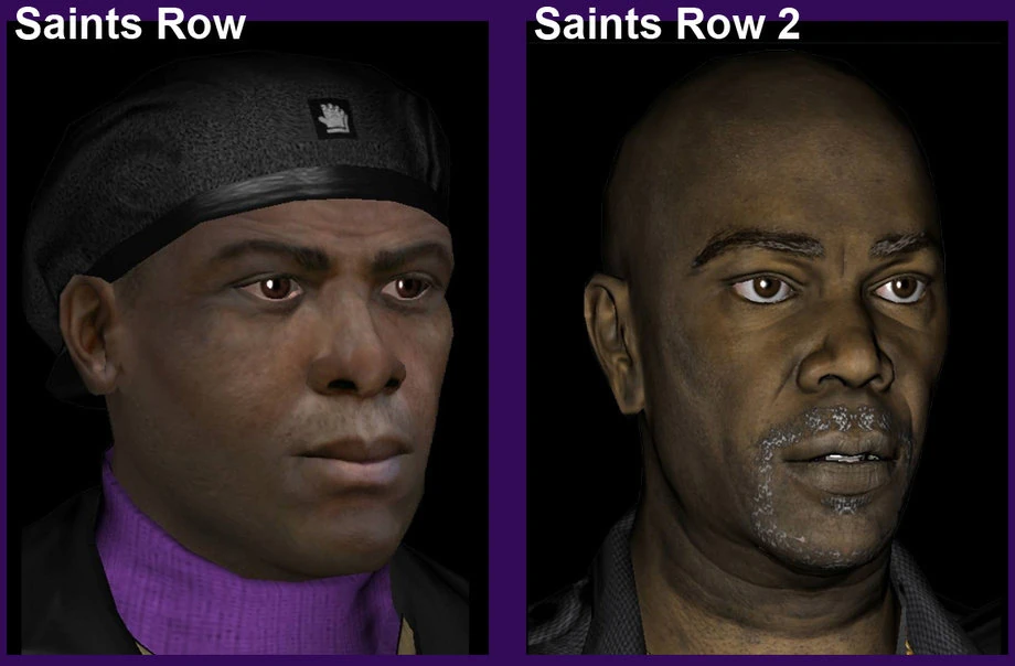
Take, for example, Julius. Here is what he looks like from 1 to 2.
He still looks cartoonish, but a bit more defined and has less blurry textures. The transition though, looked more natural. He kinda got redesigned, but if you look closely, you can see his SR2 look still retains defining characteristics of his old SR1 model.
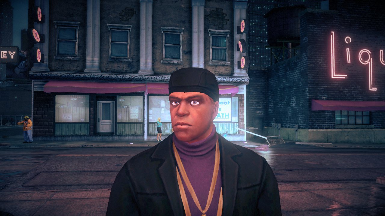
In Saints Row 4, somehow they managed to turn what looked like a decent model into a horribly, low-res design where clearly the person modelling him didn't pay any attention at all to continuity.
I mean what the? If other game developers downgraded their character models from one game to the next, they'd get lambasted to hell, but when Volition does it, it's suddenly ok? How could anyone think the in-game model looks good? It's a screenshot from the game, but it looks the same in-game when you get a good look at his model.
They got rid of so much detail because of the art direction itself. His Jacket doesn't even have a leather texture on it despite it being obviously leather in the first game. Not to mention the milky white eyes.


