SRTT Saints Row: The Third - Remastered Announced

Status
Not open for further replies.
I really hate how advances in visual technology are increasingly correlated with making everyone look more ugly and unpleasant.
what you talking about here :confused: ?
this reminds me of The Outer Worlds, everyone looks similar in the game, same mouth shape, same eye shape, same jaw shape, it's weird.. everyone looks so "sterile", like if they all were the default character with minor slider changes and a different haircut.
I found this Outer Worlds/Anthem female character pics to better illustrate what I'm talkin' 'bout:
cbg3rTO.jpg
55xjq88.jpg


I really don't understand what Sperasoft's goal was. This remaster is a really mixed bag even if you forget all of the bugs.

Remaking all the major characters from the ground up was a really bad investment of resources, especially when you realize that the final product is objectively worse: the new realistic models (even if they look good) clash with the models that have only received new textures (like pedestrians and regular cops), also, making every single female character prettier seems like a good idea on paper until you realize that Monica Hughes is now more bangable than Shaundi, and also straying too far from what the characters originally looked like is bound to upset people no matter how good your new models are, because they're no longer the characters that players know and love (just look at Claire from the Resident Evil 2 remake for an example of that). My personal worst offenders are Shaundi, Pierce, Monica (since they also appear in 2 the changes are even more jarring), Kinzie (she looks more like a teenager who bought hoodie with FBI written on it in a costume shop rather than an actual former FBI agent who still wear her jacket to be constantly reminded of what she's lost), Matt (he just looks bad), and Phillipe (don't make your characters look like their voice actors unless they fit the character you're going for).
In my opinion they should have just used the models from SR4 since they are a bit higher res, and do some minor tweaks. This would have kept the art style and models consistent while avoiding the lip sync problem and still offering something of higher quality.
Same problem with the vehicles, even if their new models kick ass, it wasn't necessary to remake them all from the ground up, the original models didn't look that outdated. Just tweak them a bit. This would have also prevented them from completely changing some models, sometimes for the worse. Seriously, what the fuck happened to the Blaze?

If making the game more realistic was their main goal, this project was doomed from the start. Most of the changes they've made to the environment and lighting are pretty good. But instead of creating ridiculously detailed models for characters and vehicles they should have focused on fixing bugs and adding new content (like weapon customization, layered clothing, select items from SR4, and so on). Missed opportunity, sadly.

It's what I said on YouTube and people couldn't comprehend: All the changes, apart from graphical, are unnecessary.
 
Last edited:
what you talking about here :confused: ?
this reminds me of The Outer Worlds, everyone looks similar in the game, same mouth shape, same eye shape, same jaw shape, it's weird.. everyone looks so "sterile", like if they all were the default character with minor slider changes and a different haircut.
So you're telling me that the problem is worst than it was in Fallout: New Vegas? Shit. I really hope Obsidian's next game is the one that gives them their legendary status back.

It's what I said on YouTube and people couldn't comprehend: All the changes, apart from graphical, are unnecessary.
Phew, thanks. After watching the YouTube reviews I had to take a step back and make sure I wasn't wearing my nostalgia goggles. Everyone praising every single changes, while only glossing over some of the many problems the game has, and also saying that the third was the perfect middle ground in the series was just... unreal. And everyone in the comments just eating it up (I couldn't find yours).
At the end of the day, everyone is entitled to their own opinion and I have no right tell people what they should like, but I'd bet my bottom dollar on the fact that most of these people who are happy with what the remaster brings to the table have either: never played Saints Row 2, glossed over it or were immediately turned off by the female character model when they hit the character creation.
 
Last edited:
They use SCREEN SPACE REFLECTIONS!?!? :eek:
That's a major downgrade from the original lighting model!
I just said on Tuesday how much I liked the original because they used planar reflections instead of screen space reflections:
https://www.saintsrowmods.com/forum...emastered-announced.18025/page-10#post-114064
That's disappointing. I mean, yes, other things look good, but I'm disappointed they removed one big lighting effect I really liked.

So that's one of the reasons why I can't re-create my bombshell in the remastered? No wonder how hard I try :(
 
what you talking about here :confused: ?
this reminds me of The Outer Worlds, everyone looks similar in the game, same mouth shape, same eye shape, same jaw shape, it's weird.. everyone looks so "sterile", like if they all were the default character with minor slider changes and a different haircut.
I found this Outer Worlds/Anthem female character pics to better illustrate what I'm talkin' 'bout:
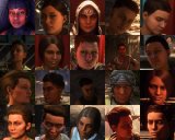
View attachment 26057
View attachment 26056


It's what I said on YouTube and people couldn't comprehend: All the changes, apart from graphical, are unnecessary.

I'm essentially trying to say that visual attempts at realistic human character models more often than not go directly into the uncanny valley, looking uglier and less authentic than more stylized visual models.
The images for Anthem and Outer Worlds are basically the perfect example of how it feels like faces appear in tonnes of triple A games nowadays (Frostbite Engine, NetherRealm, Bethesda). Broken looking geometry; disproportional facial features, neck and head-shape; atrocious looking hair; skin textures that simultaneously look incredibly oily and coarse like sandpaper. It's depressing to see Saints Row 3's artstyle completely botched and rebuilt into this weird amalgamation of broken looking hair meshes and painted on skin textures.

making every single female character prettier seems like a good idea on paper

It feels like they made everyone in the game uglier? Just looking back at the original, even though on the engine level it hasn't aged as well, the cohesiveness of the artstyle, textures and facial geometry is a lot less jarring and terrible looking than the new models. I really hate the new skin textures for the boss, I can't imagine being able to recreate my character in the remaster. I agree with you on all of your points by the way, extremely well put.
 
It feels like they made everyone in the game uglier? Just looking back at the original, even though on the engine level it hasn't aged as well, the cohesiveness of the artstyle, textures and facial geometry is a lot less jarring and terrible looking than the new models.
I guess what I meant by that is that Sperasoft tried to make most of the female characters more, let's say, objectively attractive (if that makes any sense). Take Kinzie for example, in the original she doesn't have aesthetically pleasing facial features (even if you take into account the graphical limitations), while in the remaster she's a completely different person and a much more attractive/good looking one at that. But that doesn't matter anyway because, as you've said before, these models look way too realistic for the setting they were put in.
I really hate the new skin textures for the boss, I can't imagine being able to recreate my character in the remaster.
Same here. After 9 years I recently managed to create my perfect character in Saints Row the Third, and looking at the pictures of the characters people have posted... well... even if some people have managed to create some pretty good stuff, it seems to be a downgrade in every aspect.
I agree with you on all of your points by the way, extremely well put.
Well... Thanks! You're pretty good at expressing your thoughts too.

Last point. I can't really judge the skin in great detail (as I'm only working off comparison videos), but I do think some characters look VERY good if you take them at face value: Viola & Kiki (I just personally really like their facial features), Kia (her new scar gives her so much more personality) and Burt Reynolds (don't think I need to explain this one). And just to drive home how hit and miss this remaster is, on the other side of the spectrum, you have Jane who looks like an evil Barbie doll ready to murder you in your sleep and Matt who looks like a Salamander.
 
You guys are entitled lol.
I don't know how you can reasonably think the remaster looks uglier. It improves most of graphical features, adds new ones. You can argue it's not true to the original artstyle which I guess it's subjective. I think the new "realistic" graphics upgrade coupled with cartoonish characters work really really great. Btw main characters are still flashy, far away from a realistic style like TLOU/GTA4/RE2:Remake or whatever. Finally a game that deserves to be called "remaster", yet people are still cherry picking and whiny.
 
I'm locking the thread since the remaster is out now and it's just arguments here at this point. Feel free to start a new topic in the General Chat section.
 
Status
Not open for further replies.
Back
Top